How to create affordable responsive web design in Malaysia
Malaysia responsive web design solutions
Responsive web design & development requires a good understanding of the basic elements of web design such as structure, navigation, UI design, SEO, content development and website functionality. The first step in web designing is to develop the website structure which forms the foundation of the overall web development. The visual design should incorporate best web design practices. Elements such as colour, fonts, graphics, and user interface will determine the overall user experience. The website should look good on any device such as desktops, laptops, tablets and smartphones. Stylics Design will help you build attractive and responsive website designs in Malaysia. We will cover some basic areas in responsive web design and development.
Basic websites
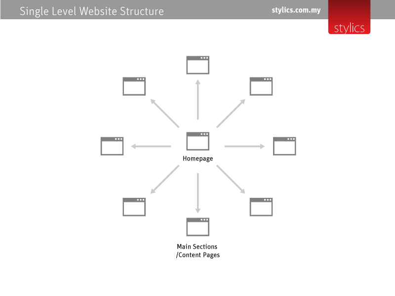
Consisting of a homepage and a few sections and pages, this is most suitable for small projects, or as an extension of a larger website. The single level structure is easy to navigate and content is easy to organize. Usually consisting of less than 5 pages, this type of websites are cheaper to design.
Suitable for event websites, product promotions minisites & online brochure.
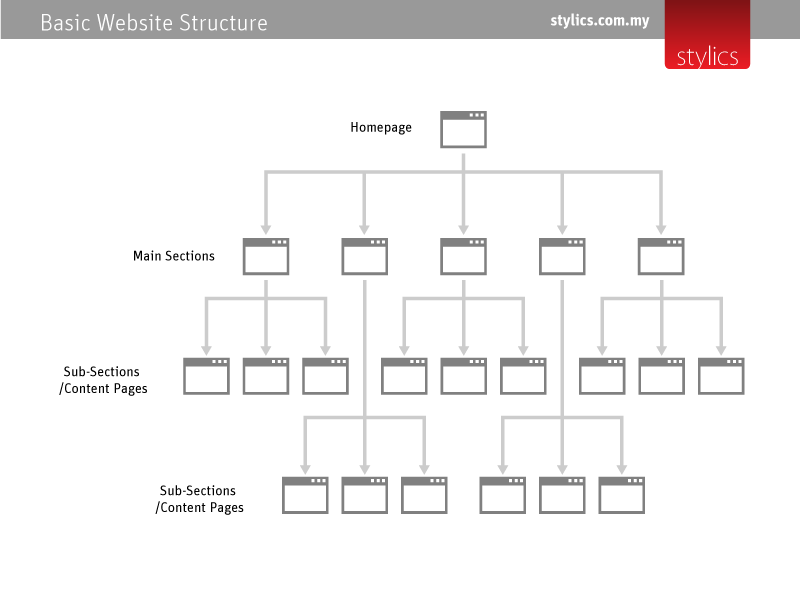
Corporate websites, e-commerce, webshops
These websites usually require a structure that can present the information in a more organised manner. Content is organised into sections and sub-sections such as news, photo gallery, articles, announcements and products. Usually built with content management system (CMS) such as WordPress or Joomla – to easily manage the website from the admin panel. Users have full control on the website to manage content, comments, and users. Corporate websites are built on this structure with responsive design using css at affordable web design rates.
Web page structure
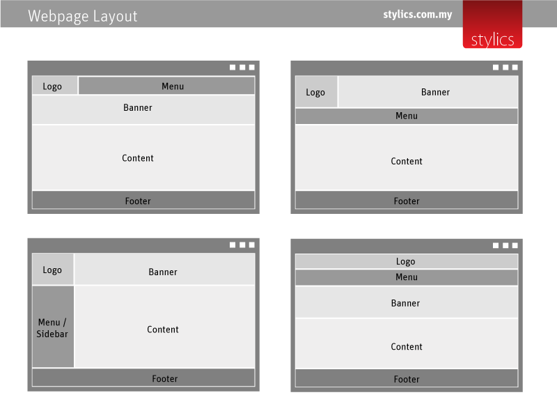
It is standard practice to have a common web page structure throughout the website which greatly improves usability. This can be achieved with web templates & themes which can be customised to reflect the corporate or brand identity. In responsive web design, the header and menu will adapt to the various screen sizes. Some elements can even be customised to be hidden on certain devices. Basic webpage sections consist of the following elements:
- Header – A bar to put your logo & tagline
- Navigation bar – Normally a horizontal menu
- Banner – Slider with images & text
- Content Area – Contains main text & images
- Footer – Links, news feeds, contact details & copyright info.
Stylics Design
Web & Graphic Design Studio specialising in website development, brochure designs, and graphic design services.
URL: stylics.com.my
Kindly use the contact form to send your enquiries.
